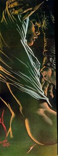
The drawing was inspired by the inside photo from this wonderful Tetra Encyclopedia of Koi which I first spied in San Francisco and bought on the spot. Since then I have used it as a guide to my koi keeping and breeding. Anyhow, as soon as I saw the photo of young koi on the inside of the hard cover, I just had to draw them. So I got out my Pentel color pens and had at it.

This was the result. Unfortunately, I really liked the drawing lots and hung it in my office at work where it got lots of natural light. Thus, the reds and oranges have faded terribly as has the blue that I used as a background.
 Click to enlarge
So, everything that looks yellow now was red or orange at one time. The piece is just really less spectacular than it was but you get the idea. As a medium, Pentel color pens and pointillism were not the way to go for drawing koi because of the color fading and the time required. I had to find another medium to capture them.


small.jpg)


8 comments:
EXCELLENT!
Just love it!
Wow. Pointillism requires such dedication and skill. I just "sketch," because at least then I don't feel too bad about the fact I'm not artistic.
Also, I now want to hide all the art hanging on my walls in dark spaces...
Even with the fading and the color change it's pretty darn spectacular, Sue. I really like the yellow and the blue together even if they aren't what you intended.
beautiful!
I was wondering about the color, it's too bad that they fade. They look really cute!
I like the ethereal quality the fading has given the painting, especially with the middle fish on the right.
Love it Sue. Fading has not diminished the beauty at all.
JJ
Thank you all for your support and kind comments!
Post a Comment